 COLD BLOODED CHILLERS #2-#3 (COMIC)
Written by Robert Heske
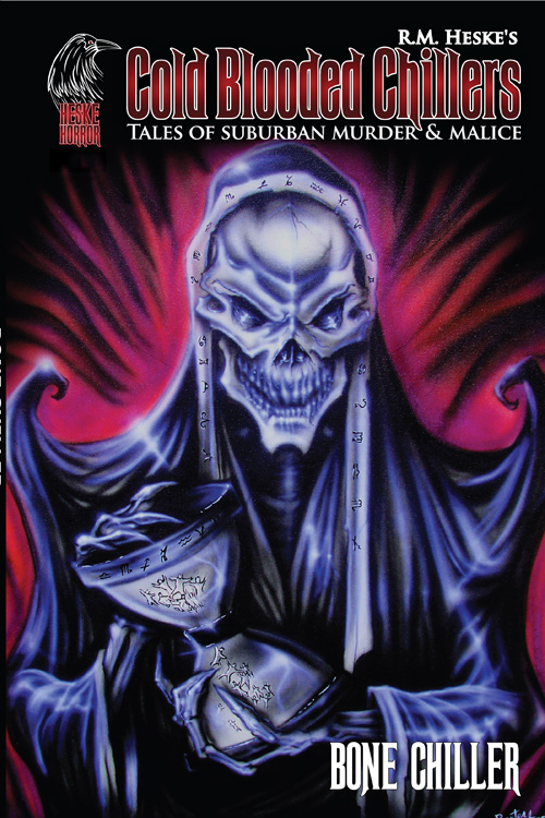
Cover and inside cover art by Mark Chilcott
Published by Studio 407
Publication Date: 2008
Format: Color
Price: $2.99
Straight off the shelves of Heske Horror comes the indy produced “Cold Blooded Chillers” under the writing of author R.M Heske with artwork contributions varying each issue. The series is laid out much in the anthology style of 3 shorts per issue. Already coming up on issue #4 the issues we are reviewing today are releases #2 and #3.
the premise of the idea is to incorporate stories dealing with suburban environments. The kind that you’d hear about your next door neighbors. Cleverly this can range a whole lot of creepy tales on perverse, odd, or questionable neighbors. Each with there take on something going on locally. Well as they say horror can be as close as next door in today’s world. Robert focuses exactly on that fact.
The issues are B&W with killer color covers popping out every issue. The style within. while in there final form of pen and ink appear to differ in styles and artistic merits. In issue #,2 we have 3 stories called “Dead Dog”, Misnomer” and “Her first day Alone”. Dead dog has an old school retro pen and ink style that asks the question, Do you really know your neighbor? A bit of bait and switch on the theme … or steps to becoming a serial killer and my favorite of the issue. Though the end I have to say was pretty obvious from the get go.
The story “Misnomer” explores the myths of the creepy neighborhood legend as told and passed along per the mouths of youngens. Or maybe its the old, we dare you to ring the door tale? Either way I’m sure you all had one of these growing up. I did. The artwork is a bit more on the rough side much like the doodling cartoonist who sketches on restaurant napkins. The 3rd story is my fav artistically but least on story understanding. From what I could take it is about a mother who is suffering from post traumatic depression. Though beyond that I was pretty lost on the flow and outcomes.The artwork though was nicely done, with shading to accent the pen work.
Next up is issue #3 that announces on the cover “Supernatural” – This edition as it states is more focused on the supernatural but less on the suburban mayhem as the previous edition. The first story is called “Shadow” which deals with issues of sodomy forced on minors. The ending didn’t make much sense to me and I could have done without the subject matter. The 2nd tale “Transcendence” has some pretty cool pen work and a simple little tale of a father and his lost daughter.
The 3rd tale called is my favorite of the 3 which is some ways had a “Deaths of Ian Stone” feel of a girl and her guardian angels. There is focus on the double number phenomena but only enough to serve the story end.
A nice start to a new series. The artwork ranges from good to “seen it before”. The stories are not consistent in engaging readers. My only recommendation would be to watch those endings so that they make more sense on a whole. As if the ending loses you, so does everything leading up to it. It appears that these are self published which I encourage to writers and authors that aren’t content waiting on the system to pull them though. Check out this and other editions.