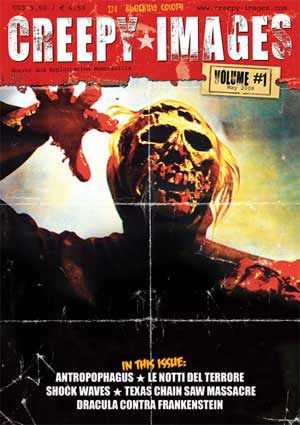
 CREEPY IMAGES – VOL #1
Published by Kessler & Benzel Gbr
Publication Date: 2009
Format: Color – 48 pages
Price: $9.50
Who says good things don’t come in small packages?
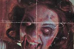
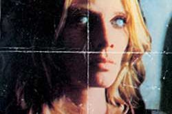
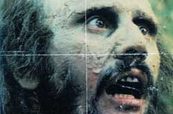
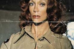
I beg to differ as today I received a rather cute and tidy read called “Creepy Images” in the mail. In this first volume you get 48 pages or cool old school horror goodness. In fact my first thought was …I wonder if they’ll pack a bunch of future volumes into a book someday? To review this is limited to descriptive words as most of it is presented as a picture book. So what is Creepy images? To narrow it down it’s a small collection of “exactly” that. Taken from a some old horror films of days long past when Photoshop was nowhere to be found and much of the advertising was still left to the artistic hands of illustrators and painters… Creepy Images is a visual tribute to a few titles at a time.
This round the featured films are “Anthropophagus” (bet you cant say that 3 times fast!), “Texas Chainsaw Massacre” (the original of course), “Shock Waves” (love that one!) “Dracula Contra Frankenstein” and “Zombie III” (just because I cant pronounce the Italian pronunciation of it)
Each film begins with a short description, and checklist on the materials that are included. The posters, lobby cards and promotions are detailed as to what they are and how rare some might be. Style a, Style B…etc there is a bit of history in the details if you ask me. My other thought here was, this kind of read is perfect for the horror collector enthusiast. I’m guessing that old original posters go for high value on the market, so what better way to keep track than a visual catalog of sorts.
Each image is reproduced in full vibrant color that is rarely seen even in today’s market. The paintings, posterized approaches and heavy detail not only make for a great poster but for a model print for t-shirts. Lobby cards, range from gritty Texas Chainsaw stuff to the jump off the page colors used in “Shockwave’s” which are borderline photo/illustration crossovers.
Hey… who knew skin could be “that” peachy? Or is it…. who knew water could be the color of blue watermelon pop sickles?
A bit of background details some of the adverts that “weren’t” aloud to be shown in theater. So what we end up with is pretty graphic stuff that most folks never saw. In the stills for “Zombie 3” we get a good look a the old school zombie makeup that was closer to caked on oatmeal than rotting flesh. Though I will confess that for what it is, it still rings with a harrowing feel that is absent from today’s films. Maybe its the grainy film stock and the moldy looking makeup but as fast as you can say “Suspiria” you know what I’m referring to. I also really dig the whole chewing on flesh images that litter the promotions. Kind of like throwing the actors a fresh spare rib that’s finger licking good with meat falling off the bone. Now that’s a meat eater.
Well we welcome this new horror read into the market with open arms, as true horror fans really can never get their fill….at least that’s from my experience. This book actually comes over from Germany but is kind enough to keep the text still in English. I stand by the comment that overseas printing which includes books, mags and graphic novels still blows away the US market in terms of ink, quality and nice looking paper stock. That’s enough of my babbling already…..check these folks out at http://www.creepy-images.com/ and pick up a issue why your at it!
 Horror News | HNN Official Site | Horror Movies,Trailers, Reviews
