Written by various
Published by Lunchmeat
Publication Date: 2009
Format: Black /White
Price: $8
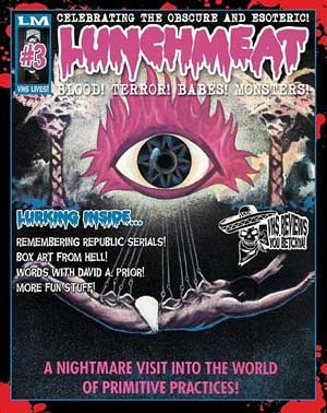
We here at the Horrornews.net club never tire of seeing another horror magazine mag come out for the masses. Not only does it provide a source of entertainment on the sh*tter (or favorite comfortable chair…take your pick) but a constant stream of horror-education to fill the fragile minds of mankind and beyond. This latest issue that was sent by the good folks at LM is titled “Lunch meat”. This issue marks #3 in there debut into the print world.
Now its pretty thin, but it does feature a nice well stock glossy cover. I think if you hold it in the sun you can reflect solar energy back into the stratosphere. The main purpose or goal with this magazine is to pay tribute tot he the old VHS movies of which most are long gone or obscured from the masses. So there’s a pro and con to this scenario.
The pro is a respect for all things classic and a few forgotten titles that otherwise might never see the light of day, let alone a review. The con is that if they are missing from public mainstream or even a simple acquire then what’s the point? Well for one the artwork to many of these are classic in there own right so for that alone they deserve a fair look at. Lunch meat has done there best to present these cover arts with clarity even though the magazine is black and white.
The middle section “Satanic covers” has some great artwork that is rarely seen in today’s market. The magazine also features a nice feature on the old series “Monsters”. Monsters deserves a fair DVD release as the former option of only getting 2 episodes per video tape was a rip off. Even in the day when these first came out I felt this way, but now years later really all we want is a season 1, season 2 set.
The issues I had with the magazine are really directed more at constructive criticisms that I think is inevitable anyways. I wont review the reviews as that just sounds plain weird, however most of the reviews suffer from too ambitious design work that makes most hard to read.
In an effort to provide graphic design, the authors used imagery underneath the reviews. Unless you really bring it down to a 2-5% black there really is no point as then it defeats the purpose of the writing. In fact the biggest golden rule of never using graphic type underneath type is evident in the “W” review. Which leaves both the design and the review as one big mess without clarity.
MY suggestion is to stick to reviews on white and design “around” the words. Especially with a grayscale magazine you don’t have color on your side to fool the eyes. Another example is the “Republic Serials” pages which clearly draws your eyes to nothing but the bold white background lettering making it impossible to read the content. In summary I think the art direction needs some serious reworking or the magazine will have a hard time gaining any fans.
Though don’t give up on these guys as I can see they mean well and have a purpose with their issues. For now I say pick one up for the old VHS cover reproductions and no so much for the text unless you have a bottle of aspirins. Over and out!!
Available at Lunch Meat
 Horror News | HNN Official Site | Horror Movies,Trailers, Reviews


