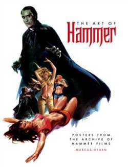
 It probably goes without saying, to those who know me, but poster art books easily rank among my favorite style art books. It is just something about the marriage of history, retrospectives and …..well horror that really are exceptional when presented in the right way. Titan Books is behind the latest one that I’m fortunate to hold on to and it’s everything a film movie buff or horror poster fanatic could imagine. The theme of this gem is “Hammer Films” under the title of “The Art of Hammer Films”. Now keep in mind, this is the stuff that really sold the industry on horror back in the early days. This was way before “floating head illustrations”, Photoshop and digital outputs, so the art was still considered a trade and art form of the marketing world. Private illustrators pained over long hours in front of canvas bring a special quality to the films that gave it elegance. I even read somewhere that egg whites were used in the final process to bring out some of those really vibrant white tones.
Now upon first viewing, you might be surprised. As you open up the pages you are greeted with famous marquee style presentations with artwork looming over bigger than life. This is something we don’t come across these days for financial reasons, for less grandiosity and because you just won’t find a theatre owner paying some one to produce neon lights that are montued and positioned over an entrance for a single feature (or for any …for that matter)
Yes, If I could go back in time, and experience moments, attending theatre in the early days would be on my list.
The Art of Hammer, while mostly horror films is a overview collection of poster art and adverts from some of their most noted titles of era’s past. Each stands as an intriguing entry into film history and the art world for that matter from a time when the print process was quite different than the ways of the current industry. What also might stand out is the marketing methods used, the gimmicks and the over the top adverts that warned viewers and urged others to approach with caution. You won’t find any of that being used today. It’s purpose was to build upon the emotional response of potential viewers and bump up the engagement scale a bit. While some posters stood out for their racy exploitation means, they seemed to do the trick by often featuring damsels in distress, animal clothed women and various versions of screaming females faces being attacked by brooding monsters and attackers. The variations in the released art is also a point of interest in how they marketing differently to other countries.
Some of the posters and films for that matter might serve as a source of amusement. For instance, “The Snorkel” – masked man with a gimmick against a teenage girl”.. I cant imagine that being a gotta-see winner..but you never know. You’ll also notice the transition to more vampire / werewolf films in the later years. Each of which feature alot of reoccurring roles for icon horror players such as Cushing, Lee and Legosi.
What is more important on this release is that it literally servers as a great designer reference for poster makers and those trying to retrograde their creations. The layouts, the colors, the fonts all scream an era that just doesn’t exist anymore. Worth the price of admission and still manages to make an excellent coffee table book. This oversized edition is a collectors piece. Great print job and great restorations!
 Horror News | HNN Official Site | Horror Movies,Trailers, Reviews

