Ah, back for more I see! Well we couldn’t leaving ya hanging on to just 10, could we? Not with so many copycat, derivative poster designs to choose from. To be honest I probably could have taken this to 30, but 20 will have to do for now. As with the previous 10, some are blatant rip-offs while others and “inspired” by (or whatever they call it). Enjoy the gallery of delights from minds that think alike!
Make sure to also check out Part 1 of Similar Horror Poster Designs
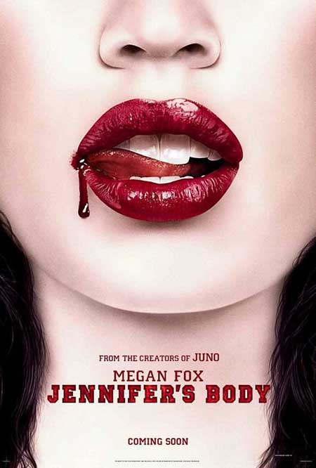
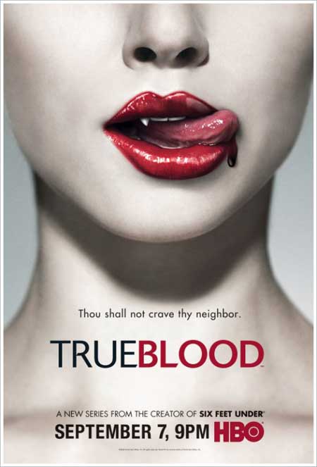
11- Megan’s Body | True Blood
Ya, the ol blood on the lips design. Actually this wasn’t Jennifer’s Body” primary poster, but it sure is a play of the theme. True Blood would have to take the lead on this one as it seems more appropriate to the series than a demon licking her lips.
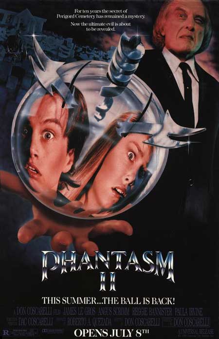
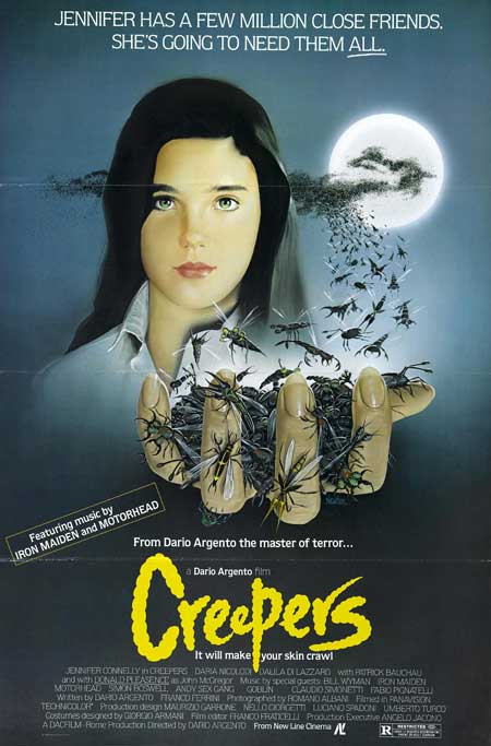
12- Phantasm II | Creepers (Phenomena)
Phantasm II came first coming off the tail end of the 70’s as Angus Scrimm glooms over his killer murder ball. Phenomena which didn’t arrive to the mid 80’s can be seen taking this same stance with a hand full of flies…..
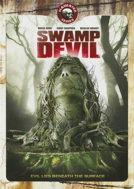
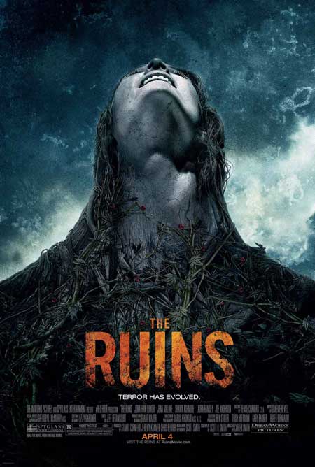
13- Swamp Devil | Ruins
Now most of you probably have heard of “Ruins” while less heard of “Swamp Devil”. Now guess what year they both came out? Yep 2008, so the coincidence is more than coincidence. I have a feeling “Swamp Devil” might have been trying to garner a bit of “Ruins” market. Or so it seems……..(or maybe same designer, lack of new concept perhaps???)
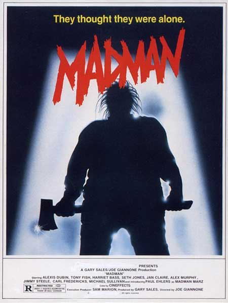
14- Madman | Just Before Dawn
Ah, the brooding killer silhouette design, which also bears a slight resemblance to the Friday the 13th original poster. However, these 2 seem like a perfect pair. Each suggesting that ominous slasher waiting in the dark…or something ….
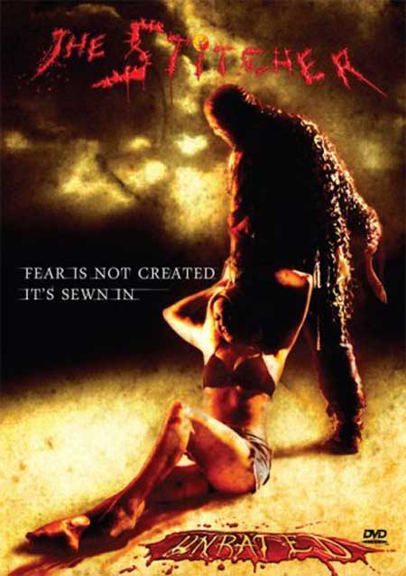
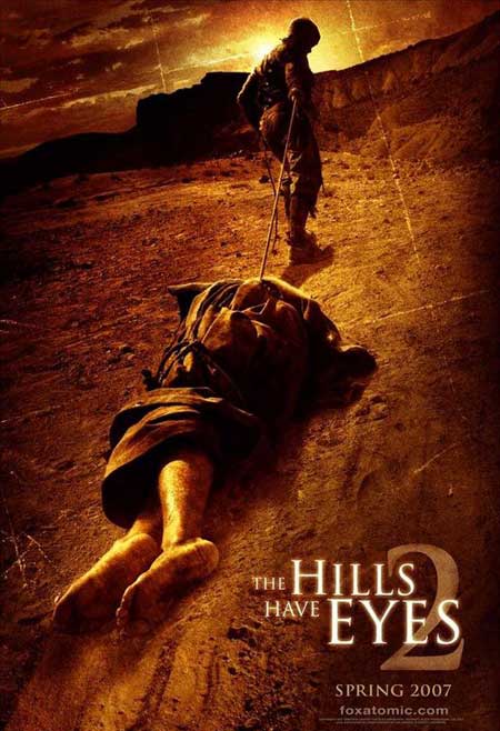
15 – The Stitcher | Hills have Eyes II
Ok, see the relationship here? Yep both films arrived in 2007, and by the look of it, I would guess the “The Stitcher” took a hint from the more popular “Hills have Eyes II”. Though it could always be that the designer was trying to get paid twice for the same design??? I love the blatant steal on this one! – Hills Have Eyes II – anyone catch that forced perspective??
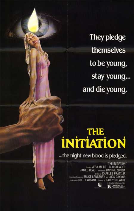
16 -The Alchemist | the Initiation
Some old school copy cats. Ya I recall a few other hand holding “something” covers from that era. None-the-less, copy cat posters from a pre-Photoshop era…..yep!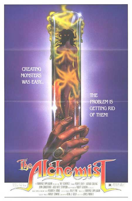
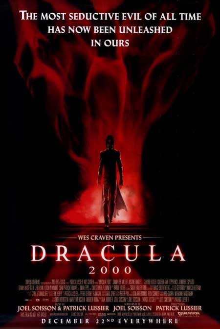
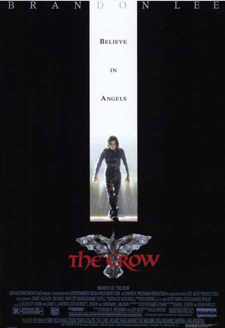
17 – Dracula 2000 | The Crow
Each of these films stands on its own. Though you can’t deny the copycat design that features “one solemn focal character” walking down the middle
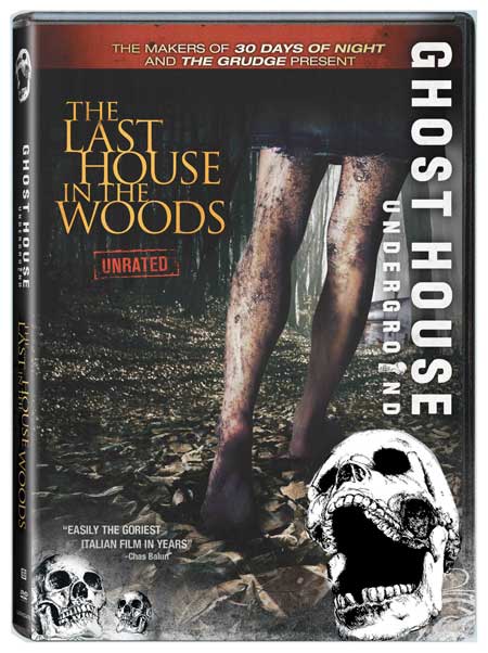
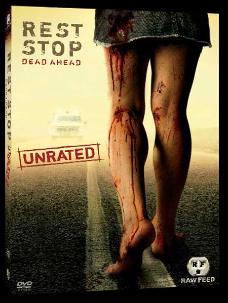
18- The Last House in the Woods | Rest Stop
So let’s go with the “dirty leg and feet” concept on this one…cuz nothing says hard times like dirty legs walking……how bout – The Last Rest Stop in the Woods??
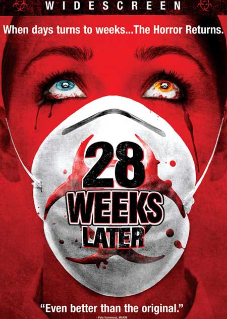
19- 28 Weeks Later | Eyes of Laura Mars
Now there is no arguing that “Eyes of Laura Mars” was first on the block (1978)…however, we get a re-awaked look of glowing eyes cover with the more recent “28 weeks Later”
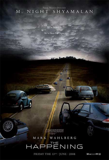
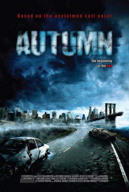
20 – The Happening | Autumn
The Happening may have not been “that” happening, however “Autumn” was far less than that. Do you think the designers were both thinking “apocalyptic road” at the same time? Nope, “Autumn” came 1 year later (2009)
– Posters with derivative art
– Horror Posters that look alike
– Horror Posters with the same design
– Copycat Horror Posters
 Horror News | HNN Official Site | Horror Movies,Trailers, Reviews

![Eyes-of-Laura-Mars-poster[1]](https://horrornews.net/wp-content/uploads/2012/08/Eyes-of-Laura-Mars-poster1.jpg)
An amusing article though I’m also reminded how underrated ‘The Ruins’ was (good book too); I’ll have to dig it up and watch it again.